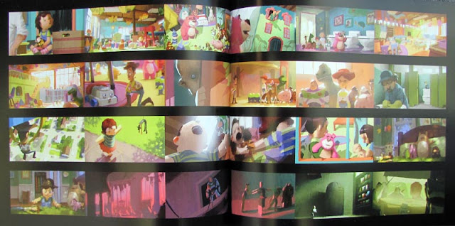
Proportion
 Proportion Example 1:
These exact same images (compositionally) clearly demonstrate a different dominant hue and value in each example given. It shows that the image's look, mood and message can be strongly affected by the ratio of a set of colours to another.
 Proportion Example 2:
These images are by the artist Lou Romano designed for the film "UP". The images on show provide a variety of moods.
 The first two images to the right make the focal point the meeting of the sun and shadow, the character is relatively balanced with his environment.
The image second from the bottom on the right is of a very intense fire though the old man present on the left is covered mostly in shadow. This is to personify his evil as he is in the dark and it makes him appear emotionless and cruel.
 The image directly below works it's proportion to make the torch and the children illuminated by it the focal point. This is because it is in strong contrast to the dominance of the darker colours.
The final image (bottom right) is bright in the background and darker in the foreground. This makes your eye goe to the cliffs first and then you spot the characters on the ledge.This is to represent the old man's destination in the film and where he needs to go.


Proportion Example 3:
These are two paintings by Vincent Van Gogh. The first painting works to suggest that the inside is a safe and friendly environment with the saturated and warm colours on show.
The second image suggests a darker world, brought about by the dominant blue tones of the image that make up much of the fore and midground. However, the image still it still implies that this realm has life and activity.
 Saturation Example 1:


