Wednesday 7 November 2012

Saturation

Saturation Example 1:
Andy Warhol 

Andy Warhol's use of saturation in his pop art paintings are a good example of the effectiveness that saturation can bring in to an image to create high contrast. This makes the focus of the image much stronger.


Saturation Example 2: 


This example shows how saturation in an image can make it appear much more happy, active and real.


The desaturated version of the same image shows a bleak and lifeless scene.


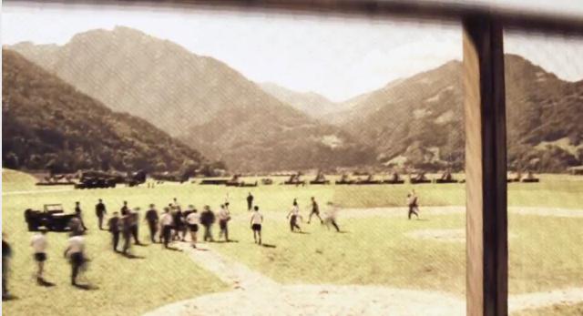
Saturation Example 3: 


These two images are in strong contrast of each other because of their saturation though they have almost the same setting.

The saturation has worked to create two different moods in the scene.


The 'blorange', blue and orange complementary colours, in the upper photo works particularly nicely 


Colour Proportion

Proportion

Proportion Example 1:

These exact same images (compositionally) clearly demonstrate a different dominant hue and value in each example given. It  shows that the image's look,  mood and message can be strongly affected by the ratio of a set of colours to another.


Proportion Example 2:

These images are by the artist Lou Romano designed for the film "UP". The images on show provide a variety of moods.

The first two images to the right make the focal point the meeting of the sun and shadow, the character is relatively balanced with his environment. 

The image second from the bottom on the  right is of a very intense fire though the old man present on the left is covered mostly in shadow. This is to personify his evil as he is in the dark and it makes him appear emotionless and cruel.

The image directly below works it's proportion to make the torch and the children illuminated by it the focal point. This is because it is in strong contrast to the dominance of the darker colours.

The final image (bottom right) is bright in the background and darker in the foreground. This makes your eye goe to the cliffs first and then you spot the characters on the ledge.This is to represent the old man's destination in the film and where he needs to go. 


Proportion Example 3:


These are two paintings by Vincent Van Gogh. The first painting works to suggest that the inside is a safe and friendly environment with the saturated and warm colours on show.


The second image suggests a darker world, brought about by the dominant blue tones of the image that make up much of the fore and midground. However, the image still  it still implies that this realm has life and activity.


Friday 2 November 2012

Colour and Narrative


Narrative Example 1: Ratatouille (2007)

These images from Ratatouille show that that colour can greatly convey the mood of the scene. The image Below 


 Narrative Example 2: Toy Story 3 (2010)

There is clearly a goodwill moment from Andy and his toys in the image (right) as the lighting is very saturated and warm and the toys are very vibrant.

Even the image top right of the 


Narrative Example 3: The Incredibles (2004)


Wednesday 24 October 2012

Value

Value example 1: Band of Brothers


(Pictured Right)  The series "Band of Brothers" de-saturated a lot of the colour because most of what we see from the 1940's is black and white. They wanted to achieve the feel of what we are used to seeing from that time period, but still make it colour. So lowering the saturation made sense.

In a situation where the platoon are out of danger whether this be when they are placed on leave or if they are out of a combat situation then the scenes are filled with a lot more saturation.

If a flashback is occurring then the scene immediately turns on the verge of black and white. 


 Value example 2: The Machinist

The machinist is a film about an industrial worker who is fighting an internal battle with himself to remain sane. The film has a large use of value use. 

It is a film that has predominantly Sepia, desaturated and black and white shots to express the emotion of the scene.

These colours also work well to convey the industrialist environment that the main character is found in for much of the movie.
The desaturated tones also work to reflect the instability the character finds himself in.


Value Example 3

These 3 images show 


Hue


HUE

Hue example 1: Cloudy with a chance of Meatballs (Sony Pictures Animation, 2009)


Cloudy with a chance of Meatballs is an excellent example of colour grading. The start of the film begins with a very bleak, grey and de-saturated look to represent the financial troubles and lifelessness in the town that the main character lives in.  

As the film progresses, the town begins to transform because of the recent prosperity and enjoyment that a food machine in the sky has produced. You begin to get very saturated colours with quite a few complementary colours coming in to play together. In the example image (top right) there is a heavily emphasised use of blue and orange a.k.a. “blorange” to personify the happy emotions of the scene.
 
The second photo on the right displays an example of harmonious colours. These are colours that neighbour each other on the colour spectrum and generally create little contrast but a lot of emotion when used correctly.


Hue example 2: UP (Disney Pixar, 2009)


As displayed in the photo’s there was a strong contrast between a happy scene and a dangerous or depressed scene.

The positive scenes would emote goodwill from the bright saturated colours, seen on the bird and on the house. On the other hand danger or negativity was evident in scenes with the de-saturated and cooler colours often featuring blacks, greys, browns and dark reds.


This colour grading works in the same principle on the characters in the film. The image 3rd down on the right shows dogs that have evil intentions so thay have been given black fur, a black domain and red eyes.


  Hue example 3: Shrek 2 (DreamWorks Animation, 2004)


Shrek 2’s use of Hue was quite varied because of the large number of locations that the characters visit throughout the film.

 The beginning location ranged from the castle in far far away e.g. the warm colours of white washed walls, red velvet, bright brown of oak to create a sense of wealth and warmth.

In contrast the forest where shrek is ambushed e.g. cooler colours of blue, green and brown to the fairy godmothers factory of predominantly different shades of grey and dark brown.